
What do you think of Barack and Michelle Obama’s official White House portraits?
Asked by
rockfan (
14627
)
February 12th, 2018
from iPhone
Observing members:
0 Composing members:
0
Composing members:
0
43 Answers

Neither of them match my taste, but art is a personal thing. If the Obamas are happy, I don’t care.
[Some wacko right winger will say that Obama in a green leafy background is actually a subtle lobbying attempt for the perils of global warming, and will try and censor it.)

I think they are a bit shit.

Too blurry for me to make a decision.

Michelle’s portrait did not look that much like her. Obama’s portrait was more accurate. I would have liked an office background to go with the outfit he was wearing. I like how his hands looked a bit bigger than the scale would dictate. (wink, wink)

Not to nit pick, but these aren’t actually White House portraits.

Not my taste, but if they like it, so be it.

I was just looking at them. I love them. Modern, not cliche. They used really talented artists who otherwise might not have received much attention. I want postcards/fridge magnets of them – and that’s not common with political portraits. They’re actual works of art.

I am getting to like the Obama one. The luxuriant vegetation and flowers seems to say something about Obama’s personality. The Michelle one would be better if it looked more like her but it is fine.

I think the Barack one is a great portrait, and 100 years from now people will get a feeling of sitting face to face with the president.
I like the other as a painting but would not have guessed it’s Michelle. That is very disappointing.
these aren’t actually White House portraits.
But they are the official portraits. There is no official White House portrait.
I had to Google that.

The One of the former Preident reminds me of the style of David Hockney, and I like it a lot.
The one of Michelle is too formal for my preference, but it is nice.

Mmmmm. I would rather have seen them done by one of the old masters. It looks a bit amateurish to my untrained eye. It doesn’t really jump out at you that it’s Michelle. I LOVE her dress though.
Just opened your video. I love the dress in the painting. I didn’t care for the dress she was wearing in the video.

I feel they should have been more professional like the earlier portraits of presidents. This seems contemporary.
Well, they aren’t like any other president @SergeantQueen.
Can you imagine if JFK had called Jackie “hot” on national television?! In fact, I can’t see any other president saying that about their wives.
Not sure what you are referring too all I was saying is that they should’ve gotten it done more professionally like these (If you scroll down you’ll see them)
I would have liked to have seen that too @SergeantQueen. Heck, TheOneAndOnlyNeffie could have done a better job, IMO.

Old Masters, my foot.
Since several students in my portrait painting class are capable of producing a very good likeness of a model, I would think that resemblance would be a minimal criterion and not something you miss so badly that it seems you thought it was irrelevant.
Michelle’s portrait is a picture of elbows. Where’s the woman? Her vitality and style are entirely missing. Her hair doesn’t even look like that. And the muted gray skin tones seem as if they were meant to disguise her honest complexion. Why?
Barack’s is a better likeness, but he is portrayed in a very harsh, severe way, There are sharp edges everywhere, especially in the jungle that’s about to swallow him. (Or maybe we’re supposed to see him emerging from a jungle in his business suit and warlike countenance. Subtle, that.) His nose is too long, distorting his facial proportions and his expression, and he has a cramped, unyielding look and body gesture.
What in the world would have been wrong with a respectful depiction that also resembles the subject? It doesn’t have to be flattering, but it does have to show dignity and humanity if the subject has them, and these two individuals have them in abundance. But not their portraits. To judge by the online images, these portraits are empty.
Reads more as a modern art piece for a contemporary museum than an official commemoration for a president.
I agree. I also wish it had been more realistic, like the old masters. Michelle’s was fine but I would have preferred it to be more life like. I don’t like the leaf thing he had going on with Barack. But it was their choice. Their preferences have always been for modern folk art.
@Call_Me_Jay _“But they are the official portraits. There is no official White House portrait.
I had to Google that.“_
Right. I mean there’s the official portrait photographer of the president that’s typically displayed in federal offices throughout the country during the president’s time in office (my understanding is that the Trump administration has yet to provide this). Then there’s the traditional official portrait painting which is hung in the National Gallery after the President’s tenure.
I personally don’t care much for Obama’s, but such a portrait ought to reflect something about the personality. I’m sure the Obama’s feel these do.
Here is a fairly interesting little clip about the decor in the Obama’s personal quarters in the White House. I’d call it “Classy eclectic.” Just like them.

They look pretty flat and one dimensional.
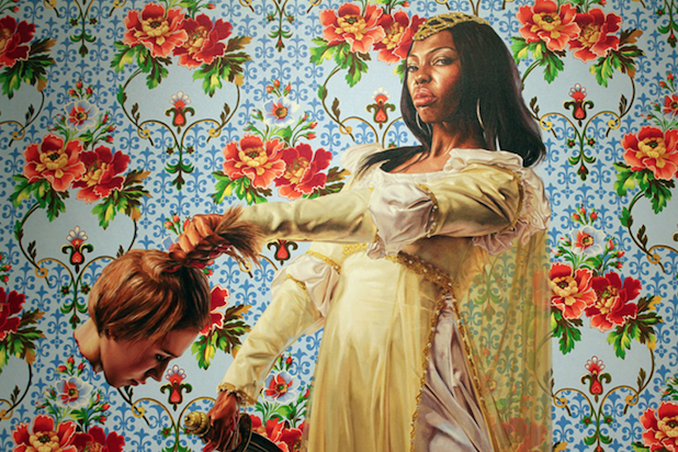
Now on a related thought, does it indicate anything that the artist BHO chose to do his portrait also likes to paint pictures of black women holding decapitated white heads?
^^^ With absolutely no context given – no, it does not indicate anything whatsoever.

Michelle even commentated on why hers doesn’t look exactly like her. Hint: She wants people to see them-self in it. The intent was for it to be a somewhat generic black woman.

@seawulf575: “Now on a related thought, does it indicate anything that the artist BHO chose to do his portrait also likes to paint pictures of black women holding decapitated white heads?”
@Darth_Algar: ”^^^ With absolutely no context given – no, it does not indicate anything whatsoever.”
The context = @seawulf575 is spreading racist nonsense.
The painting he is referring to is a painting by Wiley that has been painted many times over the years. It’s a depiction of the biblical beheading of Holofernes by Judith. But the audacity Wiley had of painting Judith as a black women has triggered racists apparently. Poor things.
That talking point about the previous paintings started spreading in a few hours.
Amazing that so many Trump fans are knowledgeable about the career of Kehinde Wiley. They must really follow the art world closely.

Neither portrait fits my tastes, but thank God there are plenty of other photos and paintings of both Obamas. For me, the chair in the greenery thing is too symbolic of “lost in the weeds and oblivious”. But look at the exquisite detail in those flowers and leaves!! Their perfection actually draws me away from the “main event.” The portrait of Michelle? There is so much about it that I dislike that my initial reaction was “apparently some artists deserve to starve.” I fully admit that the problem with this painting is MINE. ALL I can see are the mistakes. For instance, it is generally accepted that one of the most difficult things for an artist to depict is an accurate rendering of the human hand, yet here we are virtually forced to focus on…never mind.
@stanleybmanly
That’s my issue with it. It’s compositionally bad. The flowers would be an excellent framing device, but they don’t frame him, they overwhelm him. They distract from the subject of the image and effectively become the subject itself. This isn’t a portrait of a man, this is a painting of flowers with some dude lost in the midst of them.

I don’t know, I kind of like them. I guess I’m in the minority, though.
When I look at Obama’s, I feel his seriousness, his thoughtfulness, his candor, his good humor.
When I look at Michelle’s, I feel her poise, her confidence, her strength, her grace.
I also like the boldness and unexpectedness of both portraits.
I do wish Michelle’s face looked more like her—I’m glad to hear it was a decision on her part, rather than a goof, but I don’t think her face needed to look more “generic” for others to see themselves in it. I think it being her would be enough.
I was wrong about the detail and smount of work in the plant life. The BIG picture reveals all of that detail to be merely identical panels of repeating patterns—wallpaper!
The White House Historical Association is one of those things where it kinda gets into that grey area of what’s “official” and what isn’t. It’s not a government organization, but it was founded by a First Lady (Jackie Kennedy, if I recollect correctly) and works with the Office of the Curator of the White House and the National Park Service (which is the entity that actually holds the deed to 1600 Pennsylvania Ave).
I suppose it also depends on what context one is using “White House” as well. IE: “White House” – referring to the property and organization, caretaking, etc of or “White House” – referring to the presidential administration.

The perspectives and bodily proportions on both are noticeably off. Neither portrait really looks like the subject, especially Michelle, but even Barack Obama is distinctively different in the brow area. Is that supposed to be a chair Barack Obama is sitting in? Hard to tell what it is or how many legs it has.
Art may or may not be in the eye of the beholder, but a portrait should just have more depth to it—especially the eyes, facial expressions and skin tone. At best, these pictures belong on a slot machine or deck of cards,
I have a feeling the large hand is an homage to Michaelangelo’s David. There’s just no way a professional artist could have gotten those proportions wrong by accident.
This was the first version of Obama’s portrait.
Loved them when I first saw them. The more I see them, the more positively I feel about them.
The Old Masters argument. Just the words are a reason why I wouldn’t want to see old-fashioned work like that to represent current leaders.
But the Old Masters worked very hard to make a picture warm, and life-like. The detail was astonishing.
Answer this question 
This question is in the General Section. Responses must be helpful and on-topic.


