General Question

janbb's avatar

Fluther artists: Will you answer this color question (See details)

Asked by janbb (62858points) July 15th, 2020

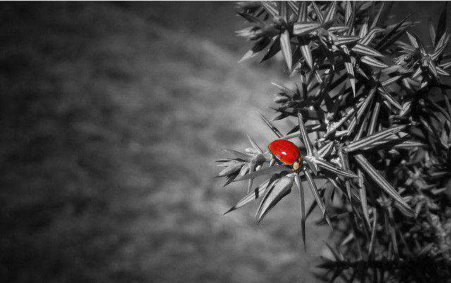
As you may know, I’m a watercolorist. One of my early teachers said not to use a color only once in painting, so for example, if you have a spot of red somewhere, it should be someplace else as well. The teacher I have now is always suggesting I put a spot of a contrasting color somewhere in the painting – perhaps a red bird, for example – to contrast with all the greens and blues in a landscape. But usually only in one place.

Obviously, I don’t need to follow rules and can do what I like – and usually do, but I’m interested in hearing from other artists as well.

Your thoughts?

Observing members: 0 Composing members: 0

28 Answers

lucillelucillelucille's avatar

Thankfully, I’ve never had any teacher tell me what to put into a painting.
I’ve always done what I like.

janbb's avatar

@lucillelucillelucille As I said, and I do. These are suggestions. But I’m curious as to your opinion.

ANef_is_Enuf's avatar

I’m with @lucillelucillelucille.

I am self taught, so I don’t have a lot of traditional drawing knowledge, I just learn as I go. My opinion is that you should do what feels right to you. For me, making art is about trusting my intuition and exploring what wants to come out more than what “should” be, but that depends a great deal on your goals. If your goal is to make the most aesthetically pleasing and “correct” artwork, then I suppose that might be the right answer. I don’t know if that’s true, though, because I’ve never learned that.

lucillelucillelucille's avatar

@janbb -My opinion is that “rules” like that are take away enjoyment.
To be told what to put into your painting is like having the soul sucked out of it.

janbb's avatar

I guess i’m really asking if you have a color aesthetic when you paint. Let’s forget about rules.

lucillelucillelucille's avatar

@janbb-I don’t have a preference for any particular palette.

ragingloli's avatar

If you want to draw attention to that object in the scene, of course it is fine to only use that colour in that spot.

janbb's avatar

@ragingloli Good example!

JLeslie's avatar

I don’t agree with these type of hard and fast rules, because sometimes a single use of a color brings focus to something that you want the observer to focus on. Or, it is to emphasis something dramatic. One single color can be disruptive, but maybe the disruption is part of the story of the painting.

I think wanting to create balance with a color in more than one place in a piece of work, or to use colors from opposite ends of the color wheel, are good things to learn about, but there is a time and place for when it’s utilized.

I’m not an artist, I was just raised around a lot of them.

ANef_is_Enuf's avatar

I am struggling to answer this question any other way, the truth really is that it can and will look great with or without this particular suggestion based on the individual piece. It’s handy, but I wouldn’t stick to it hard and fast or anything like that. Unless you like the effect it has, which is cool, I mean that’s part of developing your style which is something that every artist probably should/will do… it’s just not one that necessarily applies to mine.

One that does is a use of black/high contrast in most of my work. It’s no more right or wrong than someone who uses a softer or more muted style. It’s really difficult to build strong opinions or rules around style because that’s not how art works. Makes me think of the quote “learn the rules like a pro, so you can break them like an artist.” – Picasso

cookieman's avatar

In design, we refer to this as an accent or focus color. Generally speaking, if the image is “full color”, then a contrasting color is used to draw the viewers eye to certain areas (that are higher up on the visual hierarchy). In this case, that color will appear more than once, but in a very limited quantity.

However, if the image is black and white, or has a monochromatic color palette (for example), you could choose a single contrasting color that would appear only once. This creates more of a laser focus on that one thing or area.

It really depends on the type of story your trying to tell with your image and how stylized vs. realistic you want to be in your representation.

JLeslie's avatar

I’m just reminded of Shindler’s List and the girl in the red coat.

My grandfather used to tell us he wanted to paint a canvas all one color and put just one dot on it. We used to giggle. We were little. I think there is an artist who did just that and made a lot of money. My grandfather used to also describe making a strawberry short cake and then throw it away.

raum's avatar

I understand these “rules” on a gut level. But I think putting them down as A Rule That Must Be Followed seems to miss the whole point of art in the first place.

I would ask yourself as you are adding these colors: How does it relate to the rest of the work? Is the incongruity deliberate?

I would reframe these less as rules and more as reminders on how these individual elements inform the rest of your work.

janbb's avatar

I’m sorry I ever used the word rules. That was not what I meant to indicate. I don’t paint with an eye towards rules. I was just curious about these two different approaches to the use of color.

raum's avatar

I don’t mean you specifically. But it sounds as if your instructors are presenting them that way?

Jeruba's avatar

My art teacher says if you use a certain color in your figure, you have to put it somewhere in the background too (which, for her, is usually abstract). This is in a portrait class. For her I think it’s usually just worked in a bit and not a distinct form or a blob.

I don’t always do this.

Another teacher said “It’s okay to do that” (present a spot of contrast) “as long as you don’t mind if it’s a total eye trap.”

I do have a color aesthetic. I like very subtle blends and smooth gradients, and my contrasts are more apt to be through light and shadow (which are of course an effect of color) than through a different color per se. Sometimes I set certain limits on a work for the sake of an effect. I have done several portraits in Prismacolor pencil using only shades of gray—warm, cool, light, dark, brownish (very different from, say, an all-graphite drawing). Narrowing the range forced a certain kind of problem solving. It also explored the versatility of gray.

janbb's avatar

@raum No, not really. My first teacher who was a Buddhist was very undirective but she was the one who suggested the repetition of color not in any didactic way. She was very gentle and I learned a lot from her in a very positive way. The current one is a little more didactic about color and the use of contrasts. Neither of them has instructed me on how or what to paint, but each has offered critiques or suggestions if I am stuck or just looking for a response. If a teacher thought there was only one way to paint I wouldn’t still be taking with them.

I liked your response though and think it is a good way to think about it.

@Jeruba Thanks for that response.

kritiper's avatar

I have always focused on content, not color. If you divide the picture into 4 equal parts, each one could be a picture unto itself.
My father did a ink and water color picture once of himself as a kid, on a horse. He was not accustomed to the horse, and he had just shot an antelope, and the horse shied from the gun’s report. Dad was having a time getting the horse back under control, reins in one hand, rifle in the other. The horse and rider were facing left front in the picture, and that took your interest to that side, just left of center. To balance the scene, Dad showed the antelope to the right in the rear of the horse, shot through the hind quarters, dragging itself away to the right rear.
Of course, there were colors of the landscape all around, but the colors of Dad’s clothing didn’t have any other like colors to do as your instructor suggests.

Response moderated (Unhelpful)
Response moderated (Spam)
gorillapaws's avatar

I’ve heard of this technique as well. It encourages the eye to wander across the scene I believe. One of my personal favorites when it comes to color is Wolf Kahn. That man could do things with subtle shades of light grey and pink that will blow your mind. I’ve definitely seen this technique in his work.

YARNLADY's avatar

The so called rules are simply descriptions of the dynamics of the painting. After analyzing how things (colors) work, rules are invented to describe it. The artist then has tools to work with as desired.

raum's avatar

@janbb Oops, I was lazy and just gave your response a GA without actually responding.

Sometimes I forget this isn’t Facebook and you can’t see who GA’d/liked your comment.

Glad to hear your instructors are more mellow than how I initially read the question. Takes a certain touch to nourish creativity. :)

Jeruba's avatar

@raum, one could also argue that it isn’t the instructor’s task to nourish creativity at all, but rather, to instill the fundamentals, the things that can be taught. The bones. You can teach discipline, technique, use of tools, history, etc. You don’t have to follow them in your independent work, but in the classroom you do.

If you have them, you can set them aside at will, but if you don’t, they’re never yours to call upon.

And if your creativity is snuffed out by having to master a little structure, it couldn’t have amounted to much.

One thing I’ve noticed in my class is that if I’m doing something demonstrably “wrong”—e.g., contrary to the teacher’s guidance and therefore presumably contrary to my intent—the teacher will offer a correction. She doesn’t say “The eye is too big in relation to the other features.” She’ll say “Check the top and bottom of the eye. Where do they fall in relation to the bridge of the nose?”

But when I’m doing something experimental—as, for example, once, turning a portrait of a young model with classic features into a painting of a sculptured bust, complete with pedestal and solid marble curls rather than described hair—she stood back and said nothing. Just let me at it.

She also tailors her comments to what she knows the student can handle. When she gets tougher, you know you’ve made progress.

This, of course, is one teacher’s philosophy, and if it didn’t work for me, I’d find another teacher. (Although right now I’d be happy to have any class at all. It’s been five months.)

So, in sum: I can furnish the creativity; that’s not her job. She instills the bones; I supply the flesh and blood.

raum's avatar

I think part of nourishing creativity is finding that balance between teaching fundamentals and letting your student explore.

Different artists thrive under different approaches. Some thrive with more structure. Some thrive with less.

An instructor could be great for one student. And terrible for another.

It sounds like you’ve found a good match for yourself.

janbb's avatar

@Jeruba As to your point about toughness when you can handle it, I had a wonderful moment after taking lessons with my first teacher for a number of years. I was working on something on a field trip and called her over and said, “It’s a piece of crap.” She said, “It isn’t a piece of crap, it’s almost a piece of crap.” I felt really good that she could say that to me. Most of the time if you weren’t satisfied with something, she would say, “It’s just not finished yet. What is bothering you about it?”

She was a wonderful person and teacher.

Jeruba's avatar

@janbb, your teacher sounds a lot like mine. My sketchbooks of the past five years show better than anything else what I’ve learned from her. She always says, “When I tighten down the screws, you know I’m saying you’re ready for more.”

I tried something rather ambitious once, and my teacher paid me a compliment on it. I demurred, saying this feature is out of proportion, and the perspective is wrong there, and it didn’t turn out as I wanted. She said, “You don’t have to point out what’s wrong with it. Leave that to other people. I complimented it.”

Of course she must have known I always do that in order to get ahead of the critics with my own acknowledgment of shortcoming; but she was telling me what I usually tell other people, which is, “Just say thank you.”

Yellowdog's avatar

As a general rule (but of course there will be exceptions) a painting looks more balanced if a color is used twice. In a painting I once did, I even painted a picnic table blue to balance the sky shining through the trees, A picnic table does not at all look like the sky, but it balances better somehow,

In another case, I had a red clay dirt road in a heavily wooded scene with some rocky cliffs on the forested hillside on the other side of a rapid river—and there was nothing to balance out the red / rust orange clay.

What to do, then, if you don’t have anything in the painting that is of the same color, then have other things of the same ‘palate’. You know, an orange tabby cat or even a spongecake-colored dog—or hiding the red in subtle hues in the rocks on the cliff, none of which are in the same color as the red clay road—will still balance.

Unlike a photograph of a pretty scene, paintings and true art stick with some kind of subtle hue, such as meadow green or golden summer or autumnal tones of marigold—that pulls a scene together, But it doesn’t have to always be a duplicate of the same color.

Answer this question

Login

or

Join

to answer.

This question is in the General Section. Responses must be helpful and on-topic.

Your answer will be saved while you login or join.

Have a question? Ask Fluther!

What do you know more about?
or
Knowledge Networking @ Fluther