
How would you describe this artist's work?
She is a Canadian artist. A lot of what I see would look great in a nursery or child’s room. She’s good at creating “depth”?
Ellen Mackay
Click on some of the individual drawings. They’re beautiful!
Observing members:
0 Composing members:
0
Composing members:
0
30 Answers

I don’t like her color palette much.

So cool! Thanks for sharing.
I would love to put some of those in my little one’s bedroom.

Paper cutouts and two dimensional. Not to my taste.

Ok for a children’s book illustration, but I wouldn’t want it on my kid’s wall. I’m not really into the paper cutout thing.

I like the naif quality of the ones without human figures.Those are too simplistic and stick-figurish. But I wouldn’t choose any for my kids’ rooms either.

Whimsical is the first word that comes to my mind.

She’s using scale to achieve perspective/depth, but maintaining the 2-dimensionality by having flat images, it’s this play between 2 and 3 dimensions that I think you’re finding particularly compelling @Mama_Cakes. Thanks for sharing, it’s an interesting style.

I think she’s talented but not to the point that most people would be bowled over by her art.

I am not very keen on them. They are bland and lack originality. (in my view)

The style of illustration is sweet and whimsical. But ultimately unmemorable and a bit derivative.
More skilled than the average person, but her line weight lacks confidence. The overworked line weight reminds me of high school students copying anime drawings in the margins of their homework.
Her technique is actually more interesting to me. I like the layered papercuts using materials with varying opacity (on what I assume is a lightbox). And utilizing a narrow depth of field to create a sense of depth with two dimensional materials. Nothing new, but I’m a fan of that kind of stuff.
Good for childrens books. Something I would pick up to flip through. But probably wouldn’t purchase.

It’s not for me. The colors are pretty blah.
Children love color and while I don’t think it has to be garish primary colors automatically for kids, these color choices have a depressive quality.
If she was going for a restful rather than frenetic look I think it could have been accomplished with soft pastels of attractive colors.
I certainly wouldn’t want any child of mine surrounded by prints of this type. Really depressing. Ugh.

I don’t care for art that has a cartoonish quality, no matter how capably done. However, I do think their delicacy is better than the bold, crude forms that so many people seem to think equate to “simple” and—why is this so?—therefore suitable for children.
Why would artistically weak depictions be better for children than something with depth of content as well as composition? I sure don’t think children ought to be surrounded by assault-caliber primary colors either, but a high degree of artistic merit holds up better for prolonged viewing. Children can handle complexity. Children can handle a lot of things better than some adults think they can.
When I was a small child, my favorite book illustrations were the ones that combined fantasy elements with a realistic style, especially those that you could look at and keep looking and still keep seeing more. I would have loved to have pictures of that sort in my room.
@Jeruba Leo Lionni comes to mind for one. And a wonderful fairy tale book I had with magical illustrations by Tasha Tudor.
@janbb, your mention of those names just sent me off looking at fairy tale book illustrations, and in almost no time I found (I think) the one I loved the most as a child—illustrated by Adrienne Segur. It broke my heart that the book was given to my sister and not me, even though I was the one who read and loved things like that. I spent hours upon hours with it anyway, and for years I tried to draw pictures like those.
I also loved the illustrations of Maxfield Parrish, Arthur Rackham, and especially the old line drawings in the Andrew Lang fairy books. I could dream over those indefinitely. That’s what I would give a child, and not something so simple and flat that you can see all there is to see in a single glance.
Yes to those! And Ernest Shepard’s original Winnie the Pooh is simple but magical.
Oh! I just checked out my fariy tale book and it was Adrienne Segur! I looked at them all the time! I loved them.
Tasha Tudor was Louis Untermeyer’s Golden Treasury of Poetry.
@Jeruba Oh I didn’t know her but yes, I love that!
@Jeruba All of the examples that you have cited are definitely better than the work in question. However, that is not to say that they are necessarily comparable. Certain styles of illustration lend themselves to certain genres of books. While I love the type of illustration that you’ve dug up, they’re not always best suited for every book.
Also, simplicity does not equate to artistic weakness. (Nor complexity to artistic strength.)
I hope you don’t think that’s what I said, @Nimis. I see an appreciable difference between this kind of simplicity and this.
Book illustration wasn’t the subject. Those were examples.
@Jeruba I was responding to your criticism of work that is
– cartoonish
– bold
– crude
– simple
– flat
– easily read at a glance
All of which might describe the work of Taro Gomi, whose work I think is perfectly suited for children’s books.
I think the simplicity (and the possibilty that it allows) is mostly what makes them so magical.
There is plenty of room for art to be good without being to my liking. I’d rather look at a Vermeer than a Picasso, myself, but they can both be great art.
When it comes to illustration (which was still not the topic), Taro Gomi’s work might be sought after for children’s books, but I would not be buying any. It makes me want to run away. I have a strong and instantaneous aversion to it for exactly the reasons you listed.
Again, however, that’s about taste and preference. The examples I gave of work I loved as a child were meant to support my position that children do not have to be condescended to with crude, bold line drawings, flat forms, and primary colors. They can handle greater complexity, and some of them would prefer to. I’m not advocating abolishing one sort in favor of the other. Are you?
@Jeruba Definitely not. I understand our tastes may differ. I just disagree that simple drawings are necessarily condescending to children. There is complexity in simplicity.
I realize that illustration wasn’t the topic, but found it interesting to find something we didn’t agree on. Wanted to explore that a bit more, as I’m always interested in what you have to say. (Sorry for hijacking, @Mama_Cakes)!
And I didn’t say that simple drawings are necessarily condescending to children. I said that I dislike (am actively repelled by, in fact) the simple drawings that are condescending to children. I don’t consider their simplicity in itself to be a redeeming virtue in those cases (which does take us back to the OP). That’s different. Did you look at my two samples of simple drawings?
I’m not sure we really disagree. I appreciate simplicity; here is one example of an image that resonates deeply with me.
However, I also think there is a level of abstraction in certain “simple” illustrations—and Gomi’s strike me as being of this kind—that actually make them less accessible to children. There is a grammar, if you will, of such illustrations that could make them less pleasing to a young viewer than something more literal. We have to learn how to look at them; and then, if you ask me, there is much less to them than meets the eye.
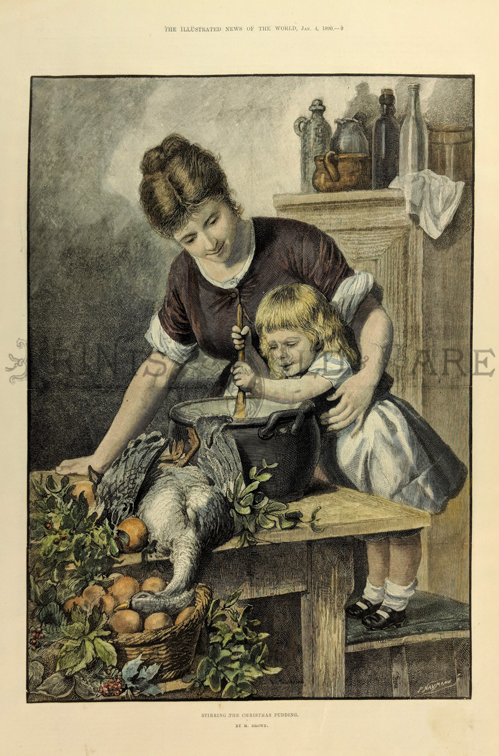
As a young viewer myself, I treasured the pictures that could hold my attention for a long, long, long time, with much to see and marvel at. Some of the ones I spent the longest with were very old-fashioned engravings in a large storybook from my grandmother’s childhood (1890’s), when a certain contrived quasi-realism was the norm. (This sort of thing.) Even now, despite a natural maturing of taste, I can largely forgive their sentimentality and unabashed moralism for the sake of the way they held my youthful gaze with believable images.
@Nimis No worries. Hey, it create a good discussion!.
@Jeruba Yes, I looked at your examples. Though I had no doubt that you could appreciate simplicity in general. I’m more interested in your take on simplicity in relation to children’s illustration. Your (positive) examples were works geared more towards adults. (That’s why I didn’t address them.)
I agree that there is some level of abstraction in Gomi’s work. But young children are the original abstract artists. And reading that grammar, so to speak, is something I believe we actually re- learn as adults.
As you pointed out earlier, children can handle a lot of things better than some adults think they can.
When you look at those intricate, believable illustrations, you are transported into their world. When you look at more abstract illustration, you create your own. It’s not just what you see with your eyes. I think a healthy imagination needs both to truly thrive.
Answer this question 
This question is in the General Section. Responses must be helpful and on-topic.


